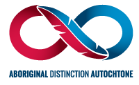


The Logo – What it means to us
As an entrepreneur, I know how challenging it can be to build (no pun intended!) the right logo for a business. And after more than 30 years in the construction industry, I also know how rewarding it is when, after several grueling brainstorming sessions, you finally achieve it: an evocative, powerful symbol of your origins, core values, and aspirations.
The truth is: our logo at Beaudoin Canada represents it all!
With Beaudoin, it’s all about the colours
Our colours, a saturated royal blue and a rich, bright red, represent of course our roots in the Upper Gatineau area, Quebec, as well as our progressive expansion towards Ontario along the Québec City‑Windsor axis. But these colours mean so much more…
Since our humble beginnings more than three decades ago, we have always strived to embody both integrity and passion. Loyalty and courage. Trust and innovation. Like no other, the colours blue and red illustrate who we are at heart and what we want to be not only to our clients, but also to our employees, suppliers, and community: a reliable, professional partner with a dynamic team and able to create bold solutions.
The key to our success
Just as our logo transitions delicately from red to blue, we at Beaudoin strike a delicate balance between these two ideals. And it is indeed balance that we seek to achieve every single day, in every regard: in each project, within every team, and within ourselves. We believe that to be truly successful, a project must not only please our client: it must also bring happiness and satisfaction to all parties involved. That is why balance remains our guiding principle, and a key feature of our visual identity.